
Jason Sonderman, UXMC, CPACCJason Sonderman

Harmony Chips: One Intent, Two Themes
Arcos · Head of UX, Harmony design system
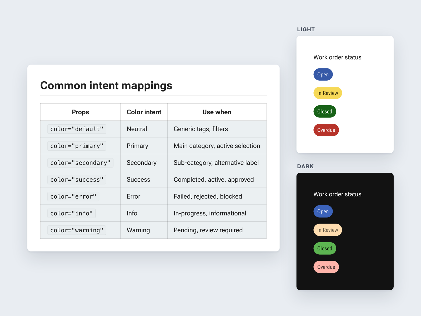
Harmony’s Chip documentation in Storybook, under the heading Common intent mappings. A table maps each color prop to an intent and when to use it: default is neutral, for generic tags and filters; primary is the main category or active selection; secondary is a sub-category or alternative label; success means completed, active, or approved; error means failed, rejected, or blocked; info means in progress or informational; warning means pending, review required. Beside it, the same four work order status chips, Open, In Review, Closed, and Overdue, are shown in a light panel and a dark panel.

Harmony’s chip documentation in Storybook. Each color maps to an intent, so a designer, an engineer, or an AI coding agent picks a chip by what it means rather than how it looks. The same work order statuses then render correctly in the light and dark themes. Agents read this guidance through Harmony’s Storybook MCP.