
Craft
The case studies tell the story behind the work. This is the work itself: finished screens, prototypes, and artifacts, shown on their own.
Filters
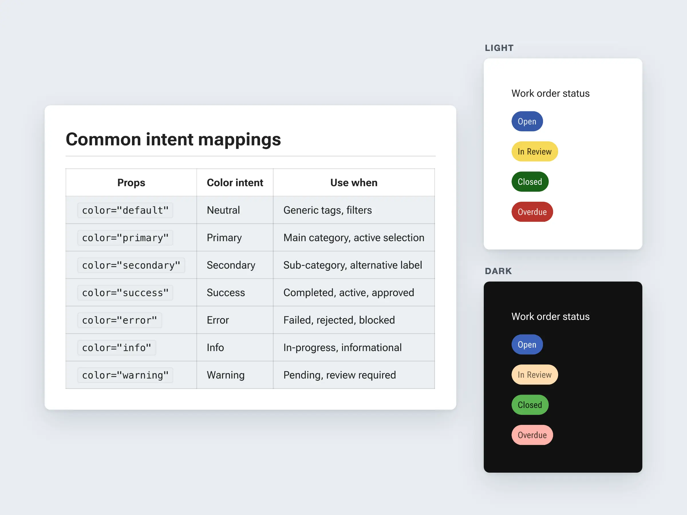
Harmony Chips: One Intent, Two Themes
Harmony’s chip documentation in Storybook. Each color maps to an intent, so a designer, an engineer, or an AI coding agent picks a chip by what it means rather than how it looks. The same work order statuses then render correctly in the light and dark themes. Agents read this guidance through Harmony’s Storybook MCP.
- Protected imageUnlock it on the detail page
Control Tower Convoy Tracking
Convoys grouped by company, with status counts and ETAs in the list, and a detail panel for the selected convoy: crew, vehicles and equipment, destination, time to arrive, the people to call, and notes, all over the live map. Convoy tracking was the MVP that shipped in August 2025, after two rounds of descoping.
- Protected imageUnlock it on the detail page
Timecards Mobile: One Entry for the Whole Crew
A crew lead enters a day’s hours once and applies them to everyone on the crew, instead of retyping each person. The screen is simple because the data model underneath it changed: it reads the crew the customer already set up. Beside it, the Arcos Field convoy screen shows where that crew is in the trip.
Final screens delivered by one of the senior designers, built from my Harmony-based prototype. - Protected imageUnlock it on the detail page
Control Tower Command Center
The back-office view an emergency manager works from during a storm: response progress, resource requests, a map, and convoy status on one screen. I built the testable prototype this was designed from, and senior designers developed the near-final screens.
Near-final screens developed by senior designers, from my testable prototype. 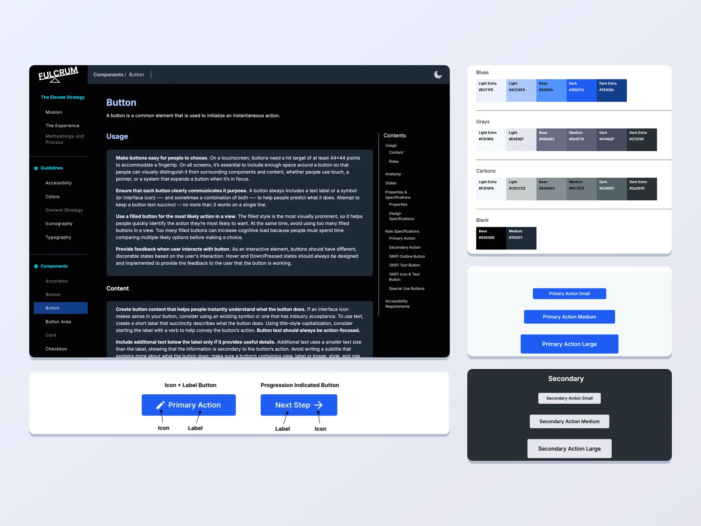
Fulcrum Guide: Components and Color
Pages from the Fulcrum Guide, the documentation site for BetterCloud’s Elevate design system. The Button page pairs usage guidance with anatomy, sizes, and role specifications. The color page lists every palette value with its hex code. Each component is shown in both the light and dark themes, so a designer or engineer can see what a component looks like and how it is specified in one place.
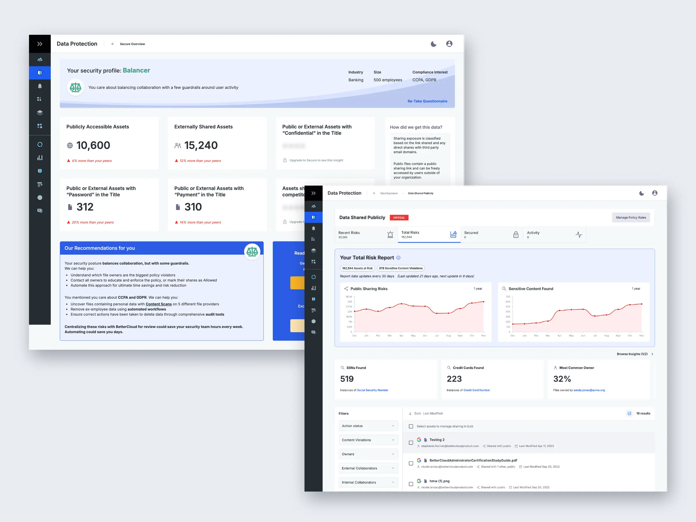
BetterCloud Secure: Data Protection Overview and Total Risks
Two screens from the Data Protection area of BetterCloud Secure. The overview turns a customer’s sharing exposure into a handful of counts compared against peers, with a short recommendation and a next step. The total risks page pairs a trend report with insight cards and a filterable list of the exposed files, so someone can go from the number to the file. The designs were handed off and development started, but the work was never released past beta.
High-fidelity design was split with another senior designer. She worked on the data visualizations; I worked on the data display in the list and on usability.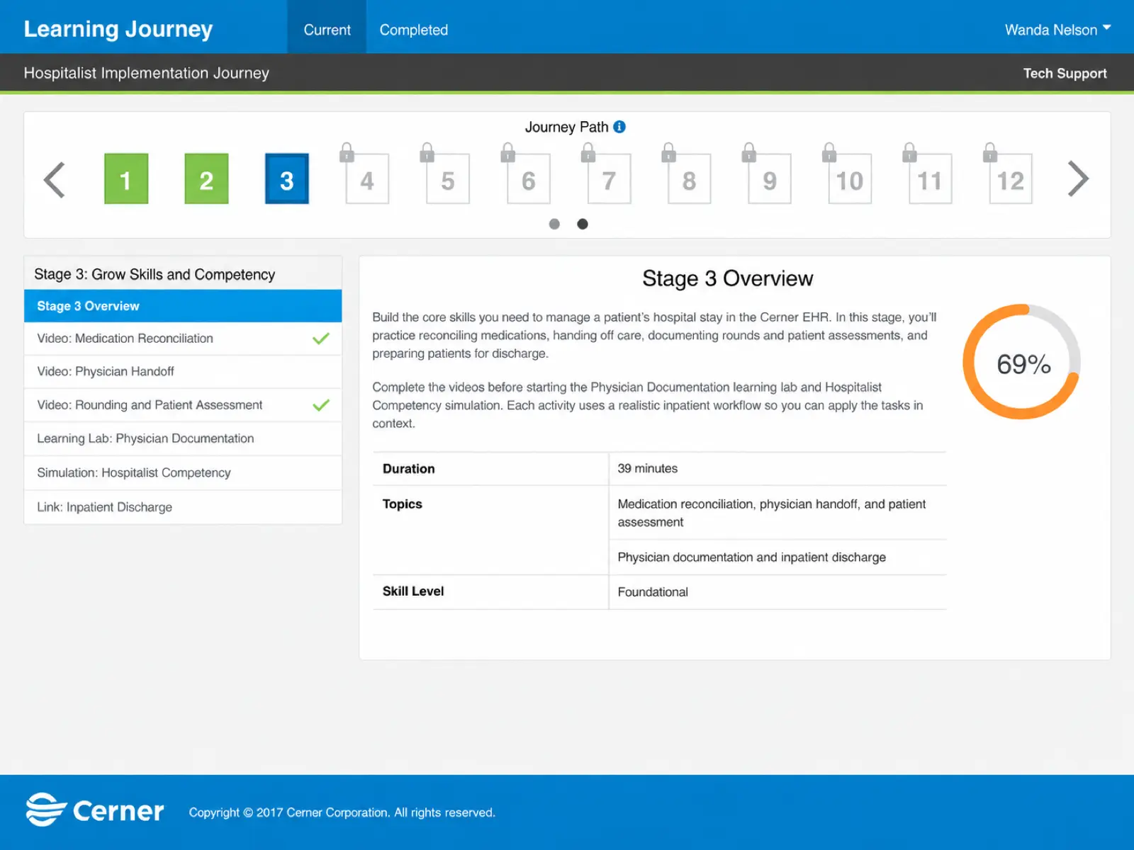
Learning Journey: A Path That Shows the Next Step
The learner’s view of a Learning Journey: a gated path of numbered stages across the top, with the current stage’s steps and progress below. Finished stages are green, the current one is blue, and later ones stay locked, so the next step is the one asking for attention. The screen uses existing Cerner design system components instead of new ones, a deliberate choice that kept it familiar and cut engineering risk when schedule margin was thin.
I built the final visuals and directed the engineers on the build. I consulted them through design, so each choice was one we knew we could deliver.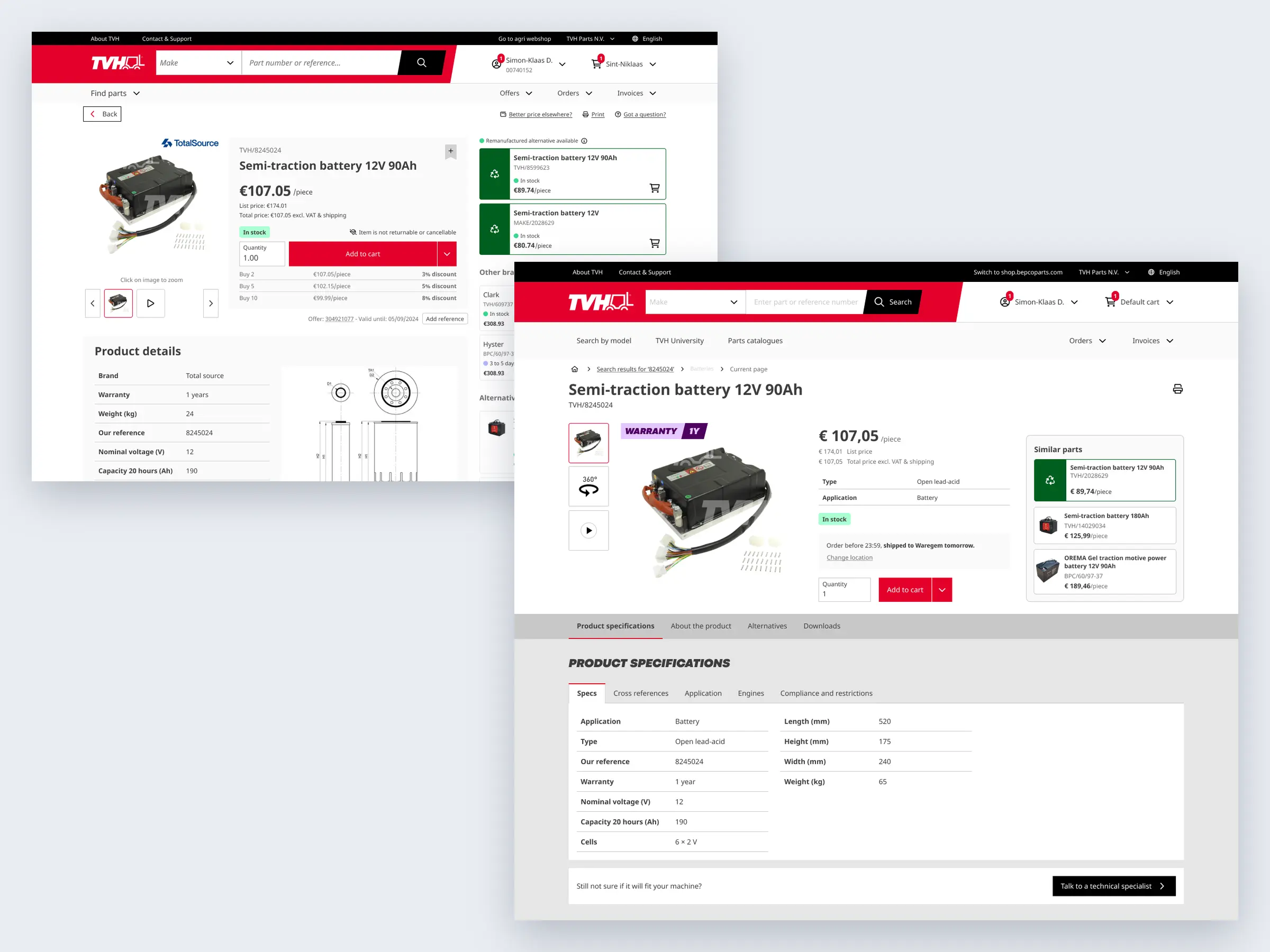
Product Page: From eShop Neo to Innovatis
The same part page, two generations. On the left, the eShop Neo page the work started from: price, stock and the add-to-cart row stacked in one narrow column, with alternatives and other brands running down the right. On the right, the Innovatis redesign, shaped by research: price leads, then the facts a buyer checks, stock and the delivery promise, ending at the cart, with similar parts in their own panel. Innovatis is where Uplift became one component system across eShop, Shop and Bepco.
Both pages were designed by a team of senior designers and me. Each of us took portions of the full page.