
Jason Sonderman, UXMC, CPACCJason Sonderman

Fulcrum Guide: Components and Color
BetterCloud · Lead Product Designer
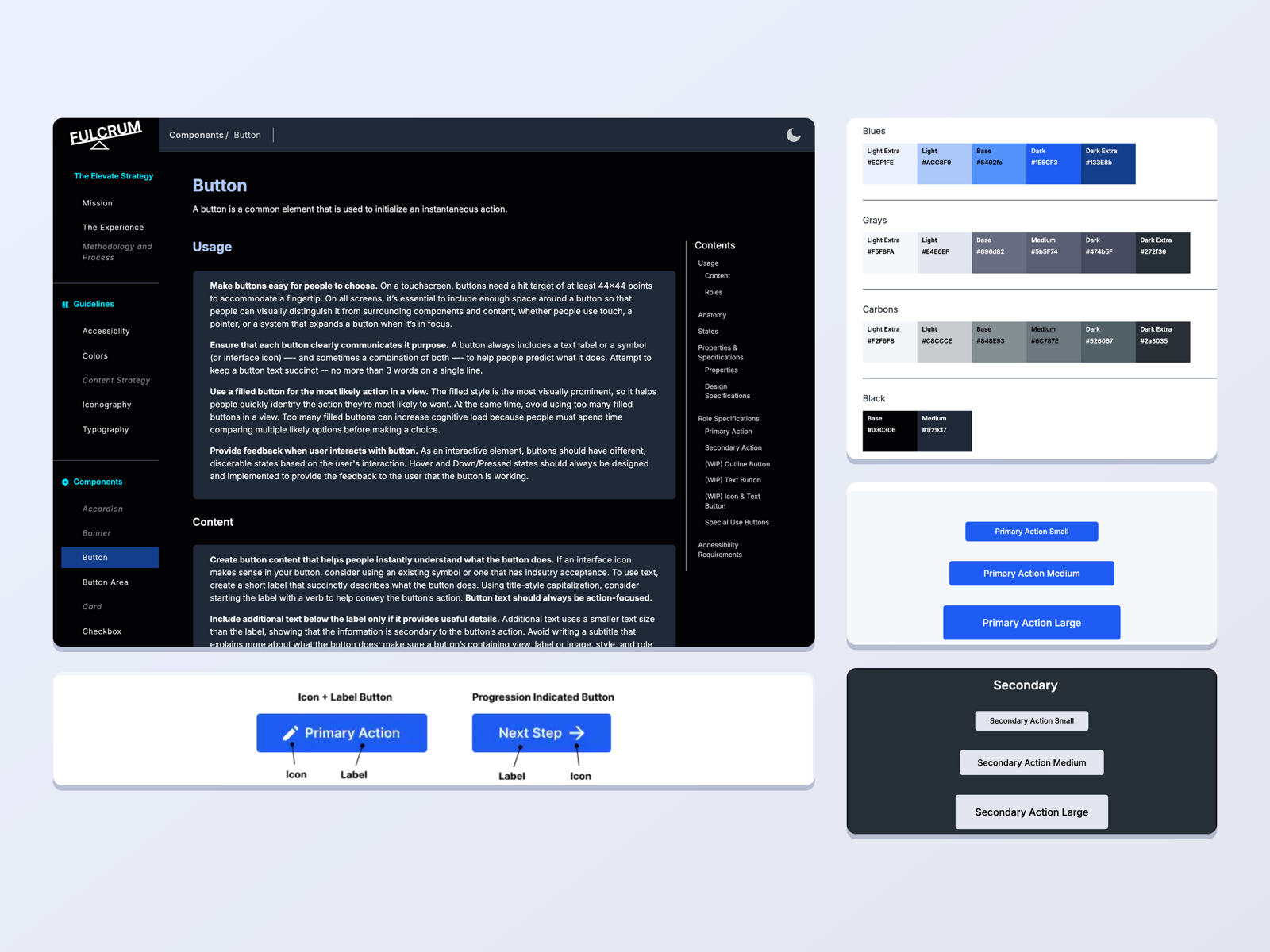
Composite of the Fulcrum Guide documentation site. At left, the Button page in the dark theme, with a sidebar of guidelines and components and usage guidance on making buttons easy to choose. Below it, the button anatomy diagram labeling the icon and label on an Icon plus Label button and a Progression Indicated button. At right, the color palette page showing Blues, Grays, Carbons, and Black swatches with hex codes, then the Primary Action button in three sizes in the light theme, and the Secondary Action button in three sizes in the dark theme.

Pages from the Fulcrum Guide, the documentation site for BetterCloud’s Elevate design system. The Button page pairs usage guidance with anatomy, sizes, and role specifications. The color page lists every palette value with its hex code. Each component is shown in both the light and dark themes, so a designer or engineer can see what a component looks like and how it is specified in one place.